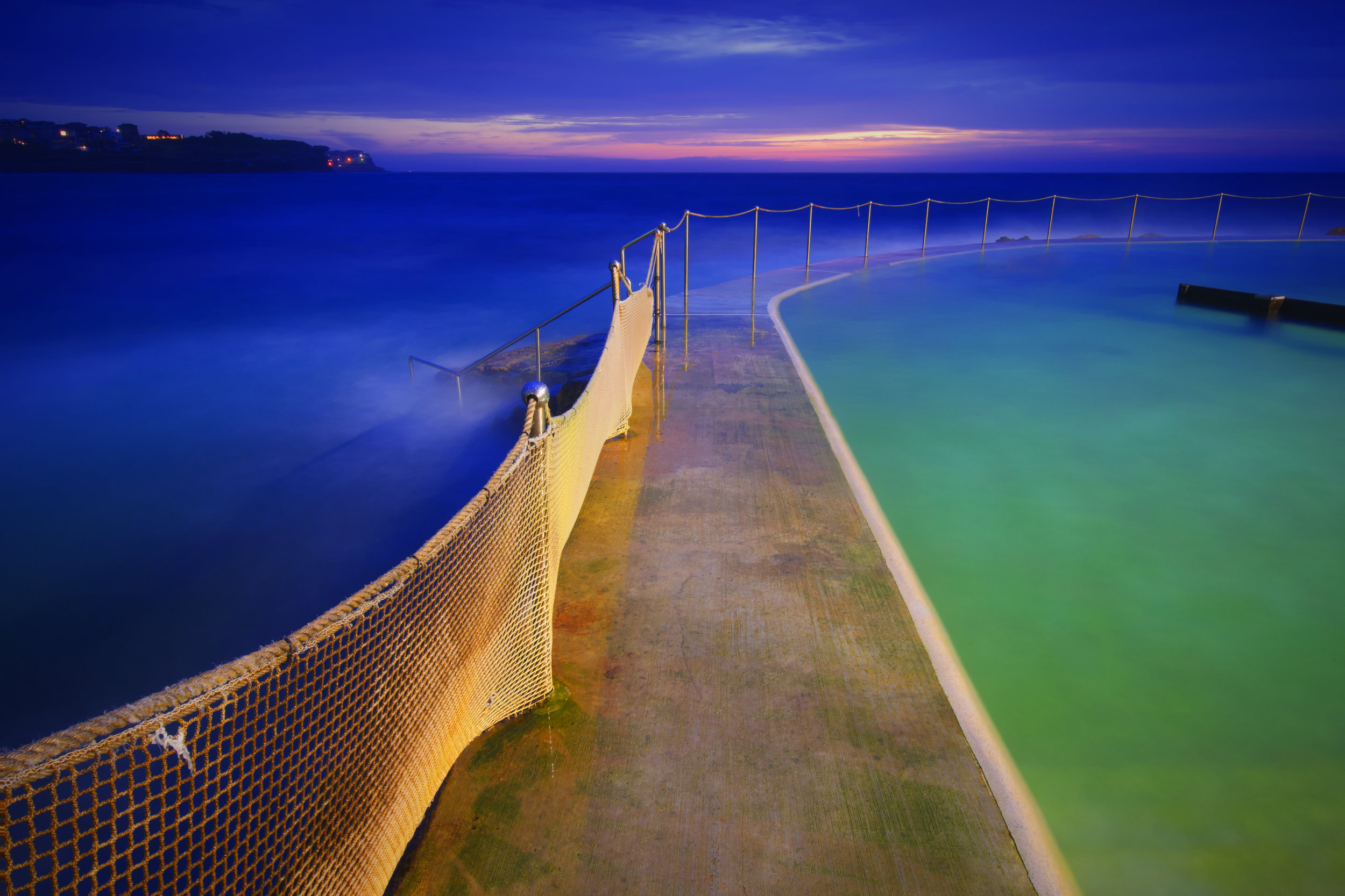
I’m totally attracted to gentle light. What do I mean by that? Well, jump on instagram or Facebook, search for some photos, and take a look at the intensity of colour you see. So many photos are excessively saturated. Here is an example of a lovely composition that I think is ruined by heavy handed use of saturation. Some people love this, but I don’t. It is eye catching, and certainly grabs the attention when seen on a small screen, but it does’t look real to me.
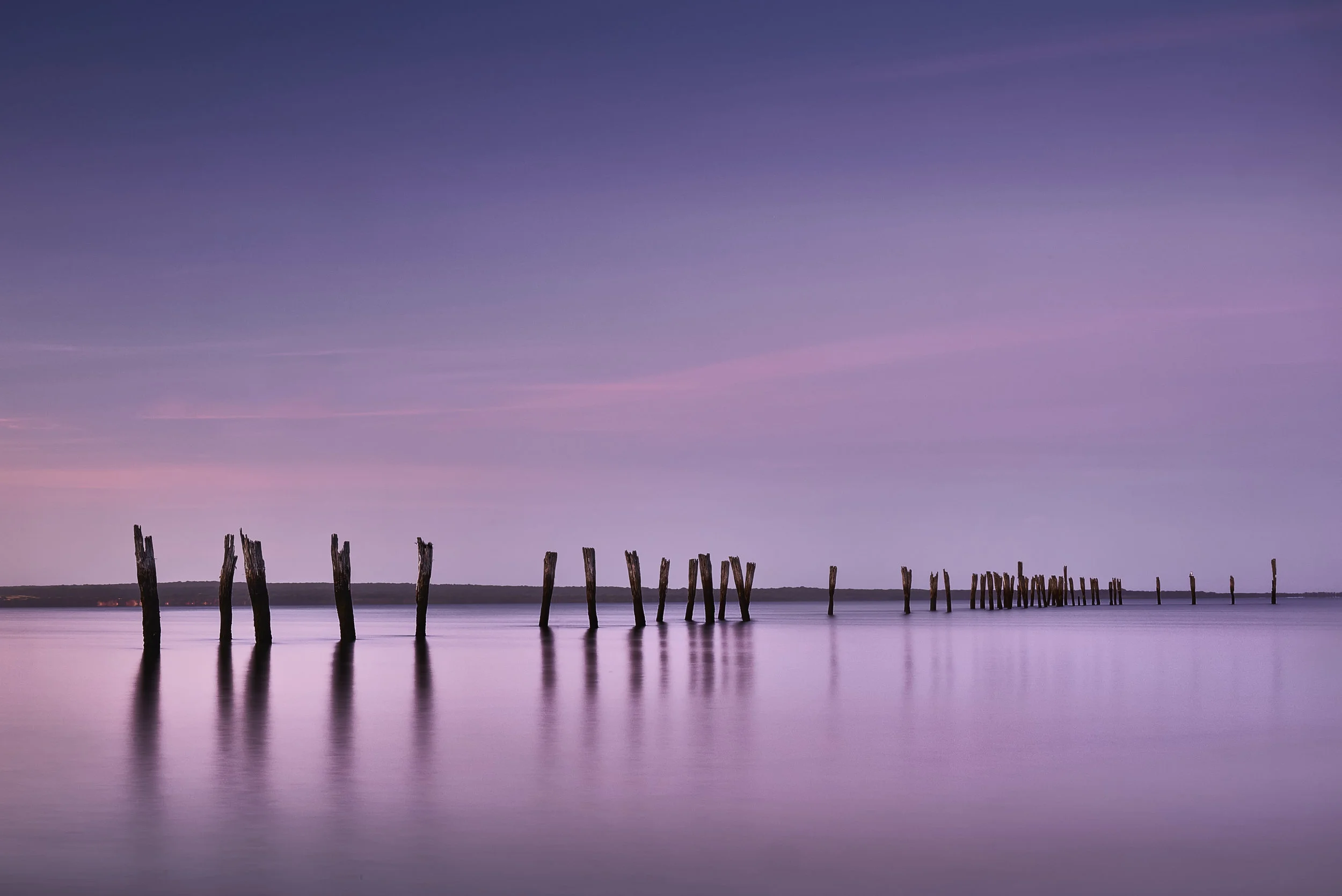
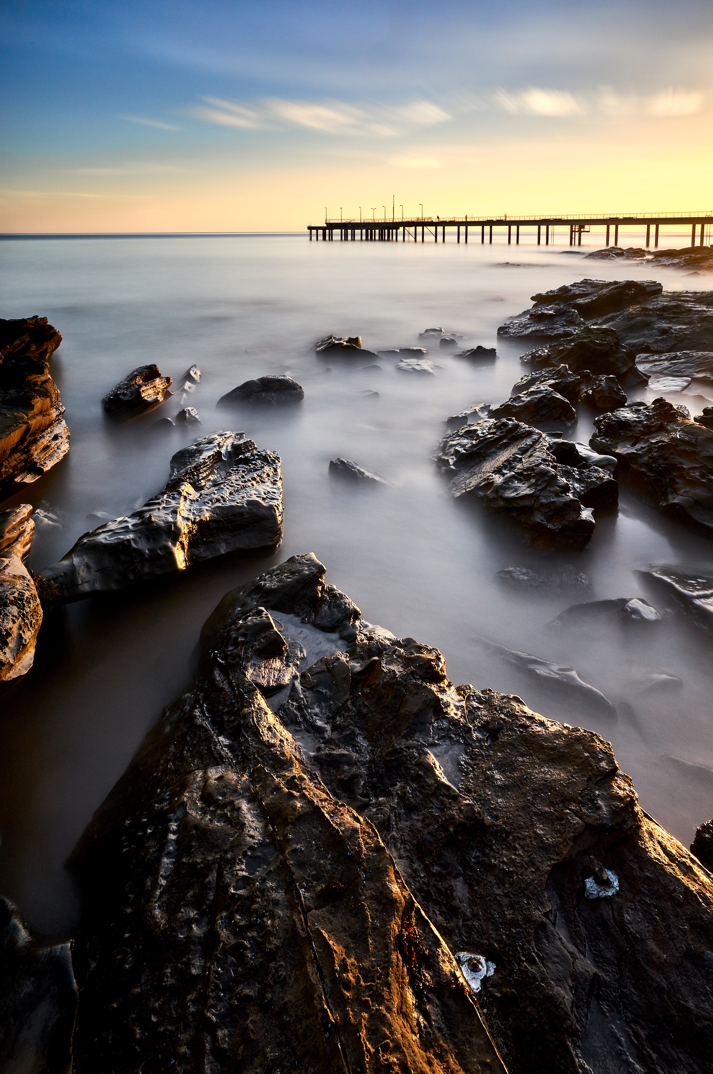
Below is an image I made at a place called Tenby Point, south of Melbourne on Western Port Bay. This is currently on display at the Maitland International Salon of Photography, and I particularly like it not only for its simplicity and its strong geometric (almost graphical) structure, but also because of the subtlety of tones in the image.
This is what I refer to as ‘gentle light’—the kind of light that you see as the day dwindles into night, pastel hues that capture the actual colours we see in the sky.
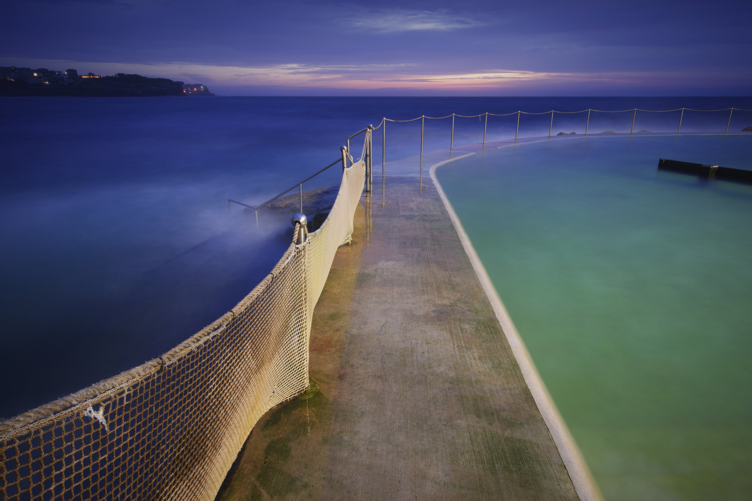
Let’s look at another image. This is a side-by-side, with the image I like (before) and the image that probably would get more likes on instagram (after). Structurally, the image is really dead simple. A strong leading line with warm tones splitting three cooler zones, the deep sea to the left, the vermillion pool to the right and the dawn sky above. The image on the left is the colour that I saw with my eye. The colour on the right is bold and brassy and vivid and (frankly) the visual equivalent of too much sugar. Which do you prefer? Sickly sweet or just a touch of the cane juice?
